
2026 Web Design Trends: Interactive, Ethical, and AI-Powered Design That Converts
- Jan 8
- 11 min read
Updated: Jun 5

2025 was all about immersive design, ethical branding, and AI shaking up how we build online. If the 83+ readers who devoured last year’s post were any sign, people want to stay ahead of the curve.
So here we are, back with a fresh roundup of 2026’s biggest web design trends: what’s rising, what’s falling off, and how you can future-proof your website right now. Whether you’re a digital entrepreneur, coach, creative, or service provider, this guide will help you design a site that looks beautiful, works smarter, and builds trust instantly.
This year, we’re seeing a shift toward real connection, personalized digital spaces, and brands that lead with emotion, ethics, and innovation. We’ll break it all down with visuals, tools you can use, and simple takeaways to implement.
Want to land high-ticket clients with your site?
Grab my free guide to learn how → Attract High-Ticket Clients
Includes case studies, trust-building fixes, and the exact sections that convert premium clients.
Table of Contents
Quick takeaway: In 2026, the websites that win feel human, build trust fast, and adapt quickly. If your site feels generic or overly polished, focus on voice, visuals, and user experience before you chase more traffic.

What’s In: 2026 Web Design Trends
The web is getting more human, more intentional, and way more immersive. In 2026, websites are no longer just digital brochures. They're living experiences that reflect a brand’s voice, values, and vibe. These trends aren’t just cool design choices. They’re strategic tools for connection, credibility, and conversion.

Trend #1:
Interactive Experiences That Feel Human
Websites in 2026 aren’t just existing. They’re engaging. It’s not about flashy animation or endless scroll tricks. It’s about building digital spaces that feel more like conversations and less like cold presentations. When someone lands on your site, they should feel like it was made for them: helpful, welcoming, and a little fun.
Interactive Features People Actually Want
Casual prompts and friendly callouts
Think tooltips and scroll-triggered questions that sound like someone guiding you, not a robot.
Subtle hover effects and scroll movement
Small things like expanding images or layered backgrounds that move with the user give your site a tactile feel.
Custom cursors and click feedback
These little details make people feel involved. It's not just clicking, it's responding.
Micro-gamification
Quizzes, progress meters, unlockable content, or reward-style animations help users stay curious and active.
Why It Matters
People remember how a site makes them feel. When it feels alive, like it was built to connect instead of sell, that emotional response builds trust. And trust leads to clicks, conversions, and long-term loyalty to your brand.

Trend #2:
Purpose-Driven Branding & Ethical UX
In 2026, people aren’t just buying products or booking services; they’re buying into beliefs. A strong brand isn’t just pretty visuals anymore. It’s what you stand for, how you treat people online, and how clearly that comes across in your design.
Websites that lead with purpose feel more human, more honest, and more aligned with what today’s users care about: transparency, equity, and impact.
How Purpose Is Showing Up in Web Design
Messaging That’s Clear and Values-Based
Visitors want to know what you're about within seconds. Are you inclusive? Sustainable? Rooted in culture? Make it obvious.
Accessible by Design
Accessibility isn’t optional anymore. Sites are using readable fonts, strong contrast, keyboard navigation, and alt text to make sure everyone is included.
Inclusive Visuals and Representation
Stock photos are out. Diverse, real-life visuals are in. People want to see themselves in all shades, sizes, ages, and stories reflected in the brands they support.
Consent-First UX
Cookie banners, email signups, and tracking systems are becoming more respectful. Brands that put user autonomy first are winning trust.
Why It Works
When your website reflects your values, you attract the people who align with your mission. And when users feel seen, they’re more likely to engage, come back, and share your brand with others. Ethical UX isn’t a nice-to-have; it’s a conversion strategy for conscious brands.

Trend #3:
Dark Mode 2.0 + Eye-Friendly Design
Dark mode has become more than a preference. Users now expect it. In 2026, it's getting a meaningful upgrade. The new version is softer, smarter, and made to reduce eye strain.
Designers are trading harsh black for deep neutrals. Charcoal, warm olive, and navy tones are creating low-light environments that feel calming and natural. This shift goes beyond looks. It supports longer browsing sessions without visual fatigue.
What’s Different in 2026
Warm, Dimmed Palettes
You’ll see fewer pure blacks and more dark grays, muted purples, and forest tones. These colors help the eyes relax.
Smart Light and Dark Toggles
Websites are now switching automatically based on time of day or a visitor’s settings. It’s an effortless upgrade to the browsing experience.
Better Contrast and Legibility
More designers are running contrast checks to make sure text and buttons stand out. It’s about usability, not just style.
Subtle Glows and Highlights
Instead of sharp white elements, you’ll see soft glows and ambient lighting effects. These gently guide the eye without being too harsh.
Why It Works
When people feel comfortable, they stay longer. Sites that support eye health are easier to navigate, especially at night or in low-light spaces. This approach to dark mode is becoming a practical UX solution with real business benefits.
Not sure how many of these trends your site already checks off?
Grab my free 2026 Website Guide and see where your site stands.

Trend #4:
AI Integration That Feels Seamless
AI is officially part of the web experience in 2026, but the key difference is how it’s being used. The best websites aren’t leading with “Look, we use AI.” Instead, they’re using it quietly to enhance the user experience without stealing the spotlight.
This year, AI is working behind the scenes to make websites feel smarter, faster, and more intuitive, not robotic or overwhelming.
How AI Is Showing Up in Web Design
Smarter On-Site Assistance
Chat tools are evolving beyond generic bots. They’re answering real questions, guiding visitors to the right services, and supporting users without replacing human connection.
Personalized Content Experiences
AI is helping tailor content based on user behavior, location, or intent. Visitors see more relevant information faster, without needing to search or scroll endlessly.
Streamlined Forms and User Flows
AI-powered forms can adjust questions dynamically, route inquiries properly, and reduce friction during booking or onboarding.
Content Organization, Not Content Overload
Instead of flooding sites with auto-generated text, AI is being used to organize content, surface helpful resources, and improve navigation clarity.
Why It Works
When AI is used thoughtfully, it removes friction instead of creating it. Visitors feel supported, understood, and guided, not sold to or surveilled. Seamless AI integration improves usability, saves time, and enhances trust, all without sacrificing brand voice or authenticity.

Trend #5:
Modular Design for Faster Launches
In 2026, speed matters. Businesses are moving faster, offers change more often, and websites need to keep up. Modular design allows brands to launch, update, and scale without rebuilding from scratch every time.
Instead of designing every page individually, modular systems use reusable sections that can be rearranged, duplicated, or updated easily. This approach keeps websites flexible while maintaining a polished, cohesive look.
Websites built with modular design feel intentional, organized, and easy to grow alongside the business.
How Modular Design Is Showing Up in Web Design
Reusable Content Blocks
Designers are creating standardized sections like testimonials, FAQs, pricing tables, and service grids that can be reused across multiple pages. This keeps branding consistent and saves time.
Faster Page Creation
New pages can be built in minutes by stacking existing blocks instead of starting from a blank screen. This makes launching new services, events, or campaigns much easier.
Consistent Design Systems
Fonts, spacing, colors, and layouts stay uniform across the site. This creates a stronger brand presence and a smoother user experience.
Easy Updates Without Disruption
Need to update copy, swap images, or add a new section? Modular design lets you make changes without breaking the entire layout.
Why It Works
Modular design removes friction from the design process. Brands can move faster, stay consistent, and adapt without stress. For growing businesses, this flexibility saves time, money, and energy while keeping the website looking professional and intentional.
Platforms like Wix Studio, Webflow, and Framer make modular design systems easier to maintain without rebuilding your site every time your offer changes.
Many of my clients speed up launches using modular templates instead of starting from scratch. If you’re DIY-ing your site, this approach saves time and keeps your brand consistent.

Trend #6:
Earthy, Real, Textured Visuals
Highly polished, over-designed websites are starting to feel cold. In 2026, audiences are craving warmth, depth, and a sense of realness. That’s why textured visuals, earthy tones, and grounded imagery are taking the lead.
Designers are leaning into imperfect, tactile elements that feel more human. Think grainy overlays, hand-drawn illustrations, natural textures, and layered shadows that create a sense of place and personality.
These visuals don’t just look good. They build emotional connection, helping users feel like they’re part of something grounded, not just scrolling through a screen.
How Earthy Visuals Are Showing Up in Web Design
Organic Textures and Backgrounds
Grain, paper, fabric, wood, and stone textures are showing up as soft overlays or backgrounds. These add a tactile feel that draws users in.
Warm, Muted Color Palettes
Instead of neon gradients or sterile whites, brands are embracing rust, olive, clay, sage, oat, and soft brown tones to evoke calm and connection.
Photography That Feels Candid
Photos aren’t overly staged or airbrushed. Real people in natural lighting, textured environments, and everyday movement are being prioritized.
Layered Layouts
Designs are less flat. Elements overlap, float, or peek from behind one another to create dimension and visual storytelling.
Why It Works
When people visit your site, they want to feel something. Earthy design elements communicate warmth, honesty, and care, qualities that are hard to fake. In a world of slick AI-generated everything, these grounded visuals make your brand feel alive and human.
What’s Out: Trends We’re Leaving Behind
Not everything deserves to make it into the new year. In 2026, users are quick to spot lazy design and outdated aesthetics. The trends below are holding websites back, making them feel cold, clunky, or forgettable. If you’re still hanging on to any of these, it’s time for a refresh.

Trend #7:
Over-Polished, Cold Minimalism
Minimalism had its moment. Clean lines and white space helped brands declutter and get to the point. But in 2026, it’s become too sterile. Over-polished websites feel impersonal and disconnected, like they were built for algorithms instead of real people.
Today's users want a little soul. They’re drawn to brands that feel approachable, warm, and real. That doesn't mean messy design. It means intentional imperfections, texture, personality, and storytelling layered into the visuals.
If your website feels like a blank canvas with nothing to say, it’s probably saying the wrong thing.
Why Cold Minimalism Is On Its Way Out
It Lacks Personality
All-white layouts with basic fonts and flat icons make it hard to tell what a brand actually stands for. There's no visual identity to connect with.
It Ignores Emotional Design
Design that’s purely functional but forgets to inspire emotion is easy to scroll past. Without visual warmth, users bounce faster.
It Doesn’t Reflect Diversity
Cold minimalism often defaults to a narrow aesthetic. Diverse visuals, earthy tones, and layered design offer more room to represent real people and stories.
AI Can Replicate It Instantly
Minimalist design is now so easy to replicate with AI that it loses uniqueness. Everyone’s site starts looking the same.
What to Do Instead
Add dimension. Use your color palette to its full range. Include human imagery. Let your fonts, visuals, and layout tell a story. And remember, minimalism with warmth is still possible. It just has to feel alive.

Trend #8:
SEO-Only Copy That Ignores Humans
Good SEO helps people find your website, but if your content sounds like it was written by a robot, they won’t stay long. In 2026, copy that focuses only on ranking is becoming outdated. Visitors want content that feels personal, clear, and genuinely helpful.
People know when they’re reading keyword-stuffed text. They’re looking for answers, personality, and a sense of connection. If your copy doesn’t deliver, they’ll bounce and never come back.
Why It's Not Working Anymore
Search Engines Are Smarter
Google is favoring websites with high-quality, user-first content. Updates like the Search Generative Experience reward clarity and real value, not keyword padding.
It Hurts Trust
Dry, robotic text makes visitors feel like they're being sold to instead of helped. People want to feel understood, not scanned for clicks.
It Doesn’t Convert
Even if SEO-heavy content brings in traffic, it rarely leads to bookings or sales. People need to feel a connection before they take action.
What to Do Instead
Write for people first, search engines second. Use keywords where they naturally fit, but focus on tone, clarity, and relevance. Be specific. Be real. Great copy should sound like it came from your brand, not a bot.

Trend #9:
Generic One-Page Templates
One-page websites used to be trendy and efficient. But in 2026, they’re starting to feel like shortcuts instead of strategy. When everything is crammed into one long scroll with no structure, no flow, and no depth, it creates more confusion than clarity.
These templates often skip the storytelling and strategy needed to guide users through a brand experience. And without multiple touchpoints, visitors don’t get a strong sense of who you are or why they should trust you.
Why It's Not Working Anymore
Limited Depth
You can't build trust or explain your offer clearly when there’s no space for detail. Users want clarity, not clutter.
Hard to Optimize for SEO
Search engines favor websites with structured content and clear hierarchy. One-page templates don’t leave much room for keyword-rich sections.
Feels Like a Shortcut
Instead of feeling simple and intentional, many one-page templates feel rushed and underdeveloped.
What to Do Instead
Break up your content into thoughtful pages like Home, About, Services, Contact, and Blog. Design each one with purpose. Guide users through your story, your value, and your offer. A multi-page site doesn’t have to be overwhelming. When done right, it’s clearer, more strategic, and easier to navigate.

Trend #10:
Invisible Brands (No Face, No Vibe, No Voice)
Faceless, voiceless brands don’t stand a chance in 2026. People are craving connection, story, and identity. If your brand has no personality, no visual identity, no clear tone, and no real person behind it, it becomes forgettable. And forgettable doesn't convert.
A bland logo, stock graphics, and generic copy may have worked a few years ago, but now, users are more intuitive. They can tell when there’s nothing behind the curtain.
Why It’s Not Working Anymore
No Connection
People follow people, not logos. If your brand feels like a bot, users will scroll past.
No Differentiation
Without a vibe or voice, you blend into a sea of sameness.
No Trust
If there’s no visible founder, team, or mission, users are less likely to buy or book.
What to Do Instead
Put a face to the name. Show up with your voice, your energy, your unique perspective. Invest in custom photography. Use language that feels real. Highlight your team, your process, your story. Show people who they’re doing business with. A strong brand personality is magnetic.
If your site looks good but isn’t converting, it’s usually not a design problem. It’s a structure and strategy problem.
I offer website audits and full brand refreshes for service providers who want better clients, not just more traffic.

Final Thoughts: Build a Future-Ready Website in 2026
Trends change, but one thing stays the same: websites need to connect with real people. The best web design doesn't just look good; it also functions effectively. It communicates, performs, and builds trust.
In 2026, there's a clear move toward more human-centered, ethical, and personalized design. The trends that win are the ones that make users feel seen, heard, and understood. The trends that fall flat are cold, generic, and disconnected.
If you're serious about growth, your website has to evolve with your audience. That means showing up with intention, refreshing your site regularly, and being open to change.
Designing your site with care, whether you do it yourself or work with a professional, is one of the best business decisions you can make. One that prioritizes people, connection, and performance.
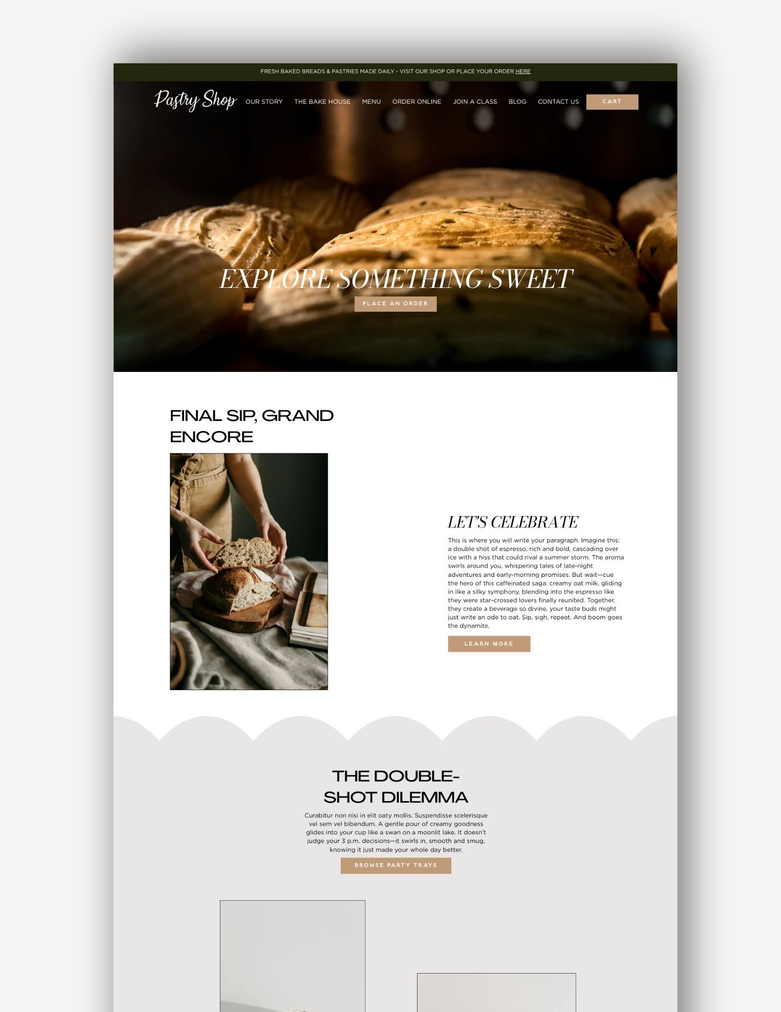
$50
Espresso Bakery Website Template
Product Details goes here with the simple product description and more information can be seen by clicking the see more button. Product Details goes here with the simple product description and more information can be seen by clicking the see more button
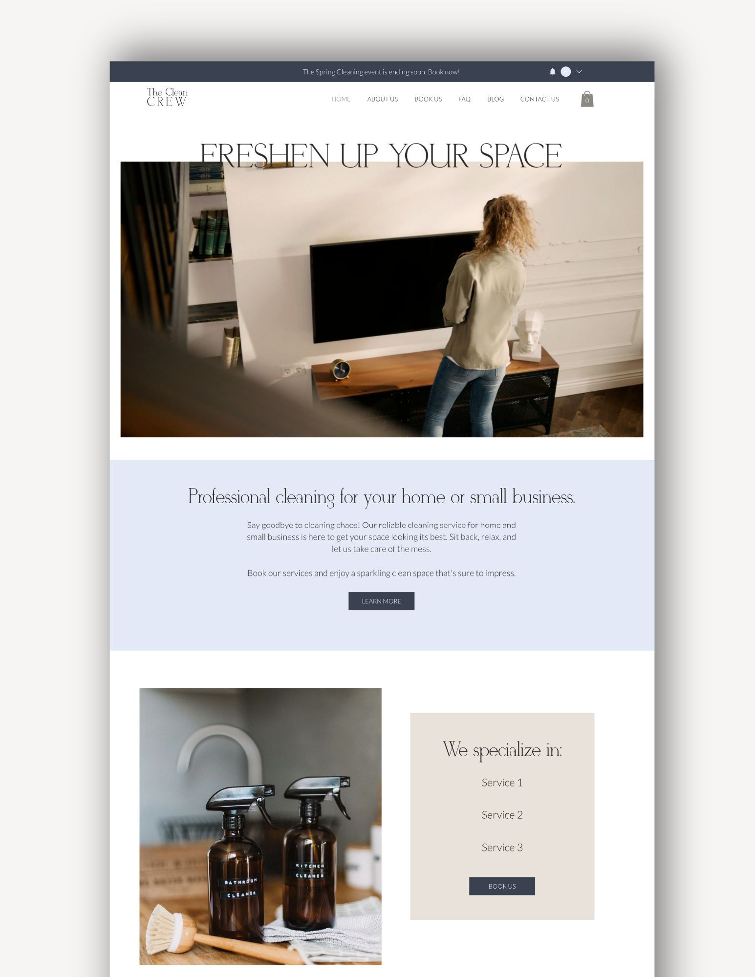
$50
Clean
Product Details goes here with the simple product description and more information can be seen by clicking the see more button. Product Details goes here with the simple product description and more information can be seen by clicking the see more button
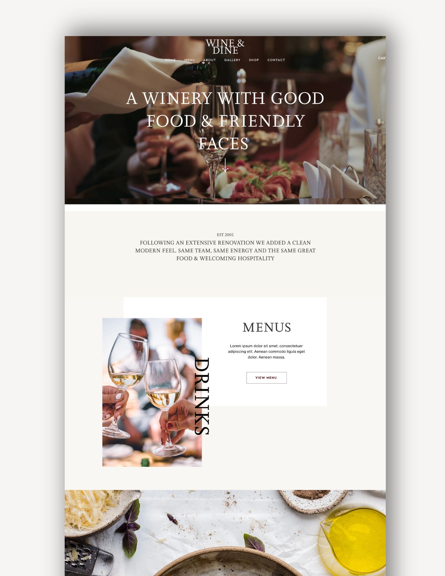
$50
Wine
Product Details goes here with the simple product description and more information can be seen by clicking the see more button. Product Details goes here with the simple product description and more information can be seen by clicking the see more button

$50
Neutral
Product Details goes here with the simple product description and more information can be seen by clicking the see more button. Product Details goes here with the simple product description and more information can be seen by clicking the see more button
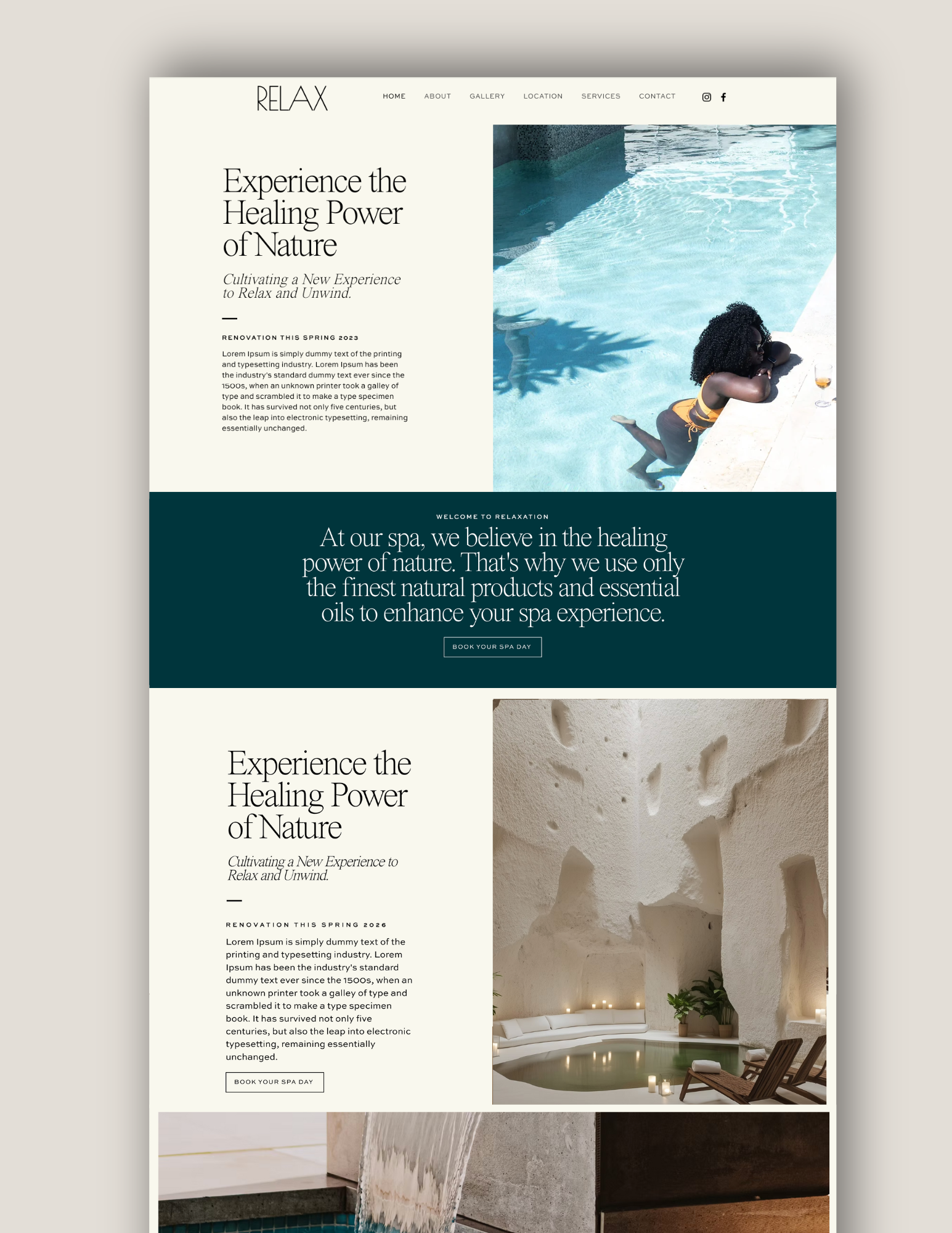
$50
Relax
Product Details goes here with the simple product description and more information can be seen by clicking the see more button. Product Details goes here with the simple product description and more information can be seen by clicking the see more button


It's great to have something to reference as the new year always brings in new trends. It's nice to know what to expect so I'm a step ahead.
I think it’s a great read. Something to bring in the new year to prepare for what’s to come. It’s nice to get an update of the design trends each year, I hope it continues each year.